Teens, parents and clinicians form one fragile network: the Triangle of Care. I led research and design for an NHS trust product that lets teens share at their own pace, and gives clinicians a dashboard they trust.
Every edge is a communication channel that can build trust, or quietly erode it. Hover the nodes.
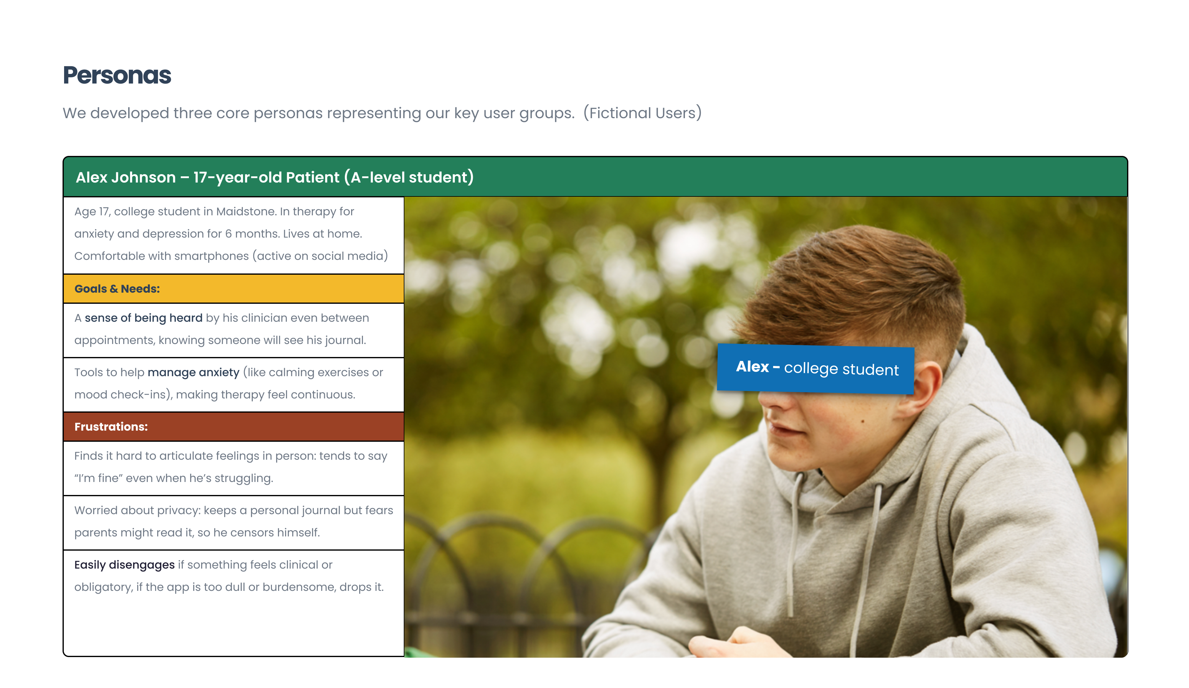
Wants to be understood without being watched. Sharing feels risky: too much invites overreaction, too little means no help. Needs control over what leaves their private space.
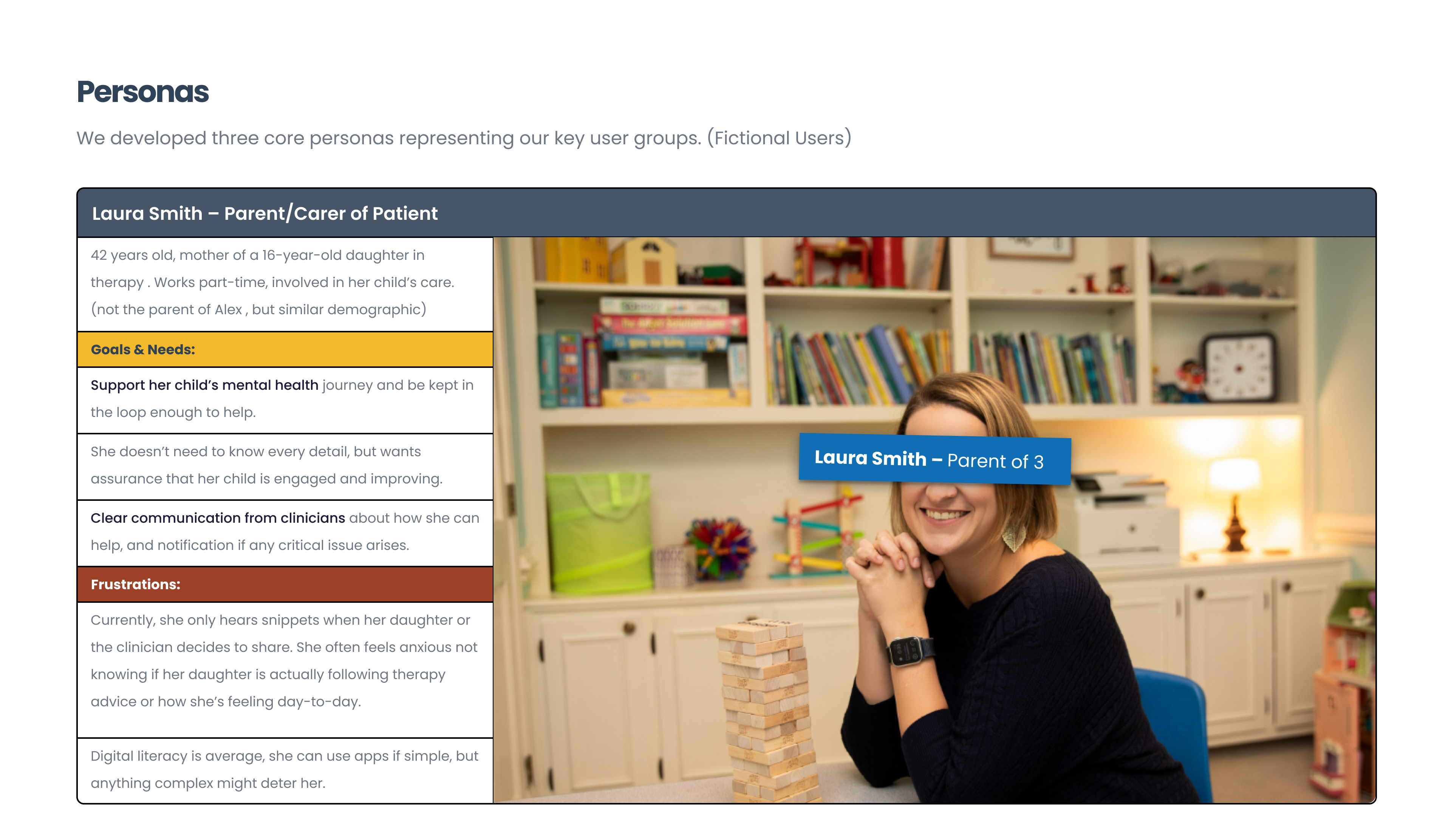
Want reassurance that their child is okay, but pushing for detail can shut the conversation down. Need enough visibility to support, never enough to surveil.
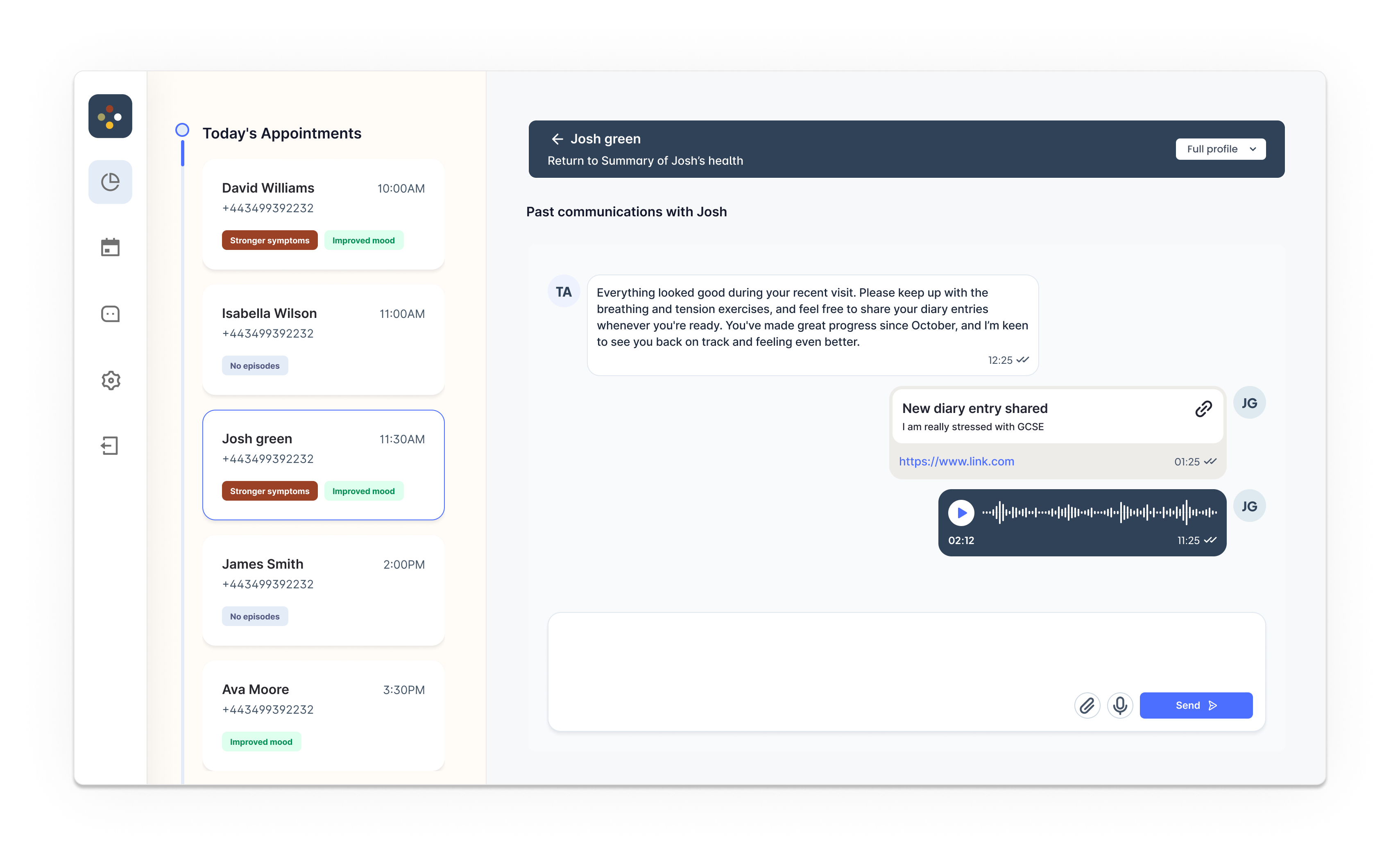
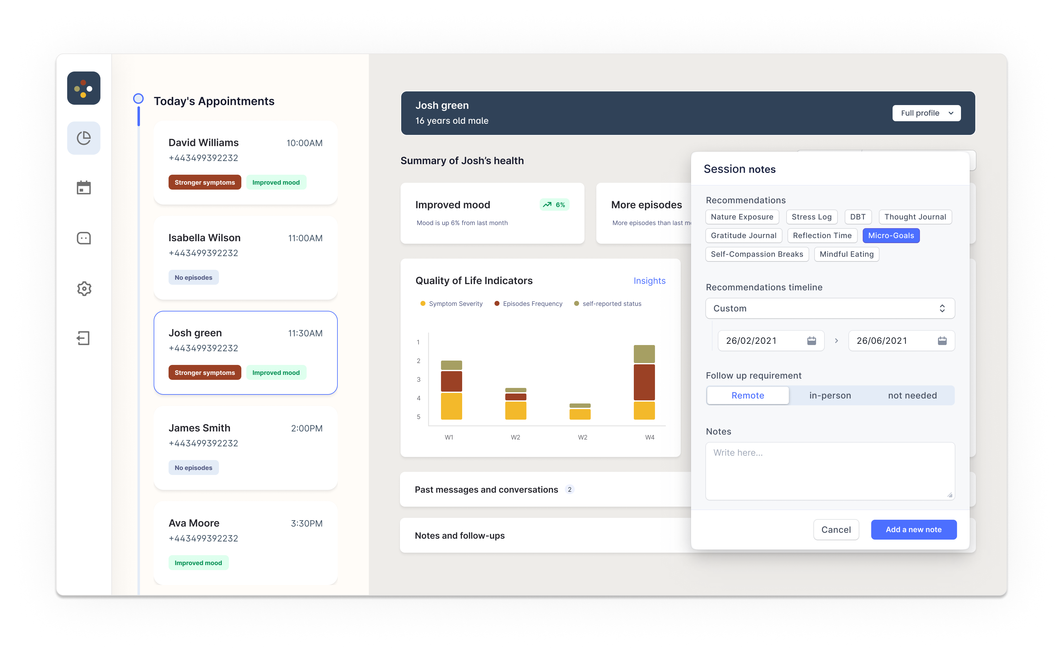
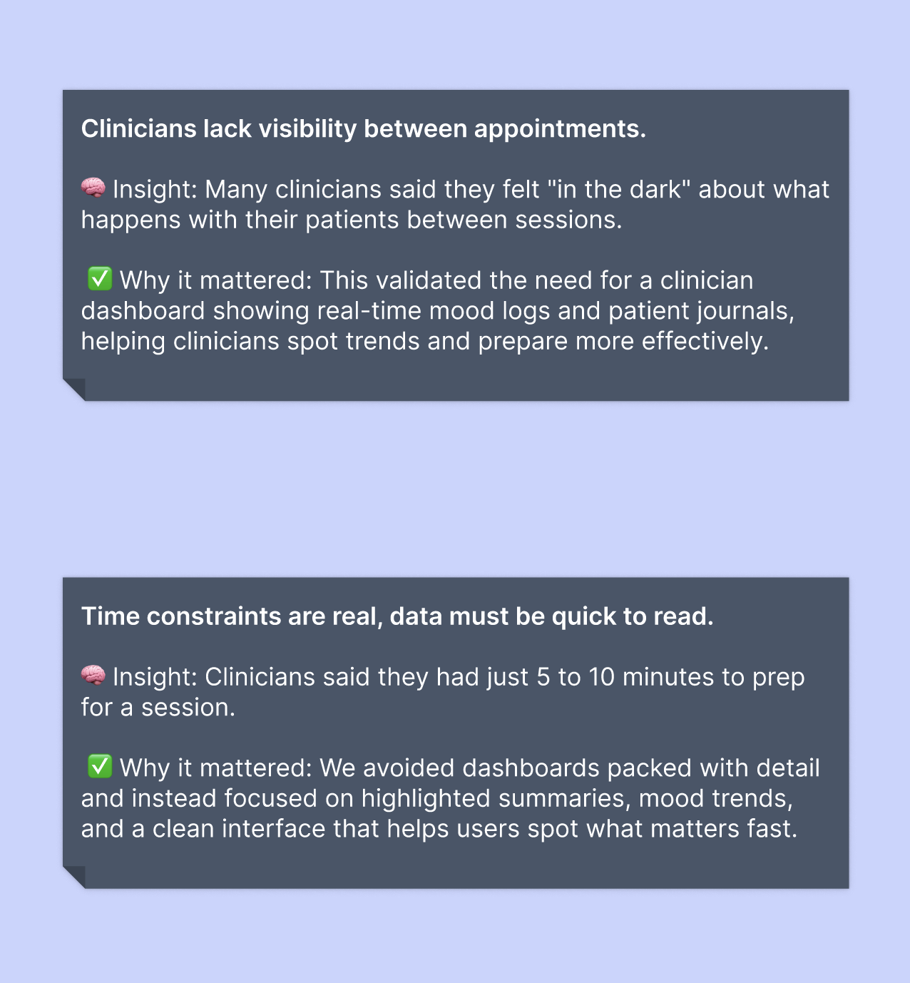
See patients for one hour a fortnight and have to reconstruct the other 335. Need signal (trends, warnings, context) in one place instead of paper notes, emails and EHR fragments.
"How can we facilitate improved communication within the Triangle of Care without compromising trust?"
THE DESIGN CHALLENGEDiscovery ran on the UK GDS service standard: user needs first, no assumptions. Even the name, "Clinician Data Dashboard", follows GDS guidance: say what it does.
Researcher and UI designer, leading both phases: scripts, recruitment, remote sessions, then interactive prototypes tested with the same users.
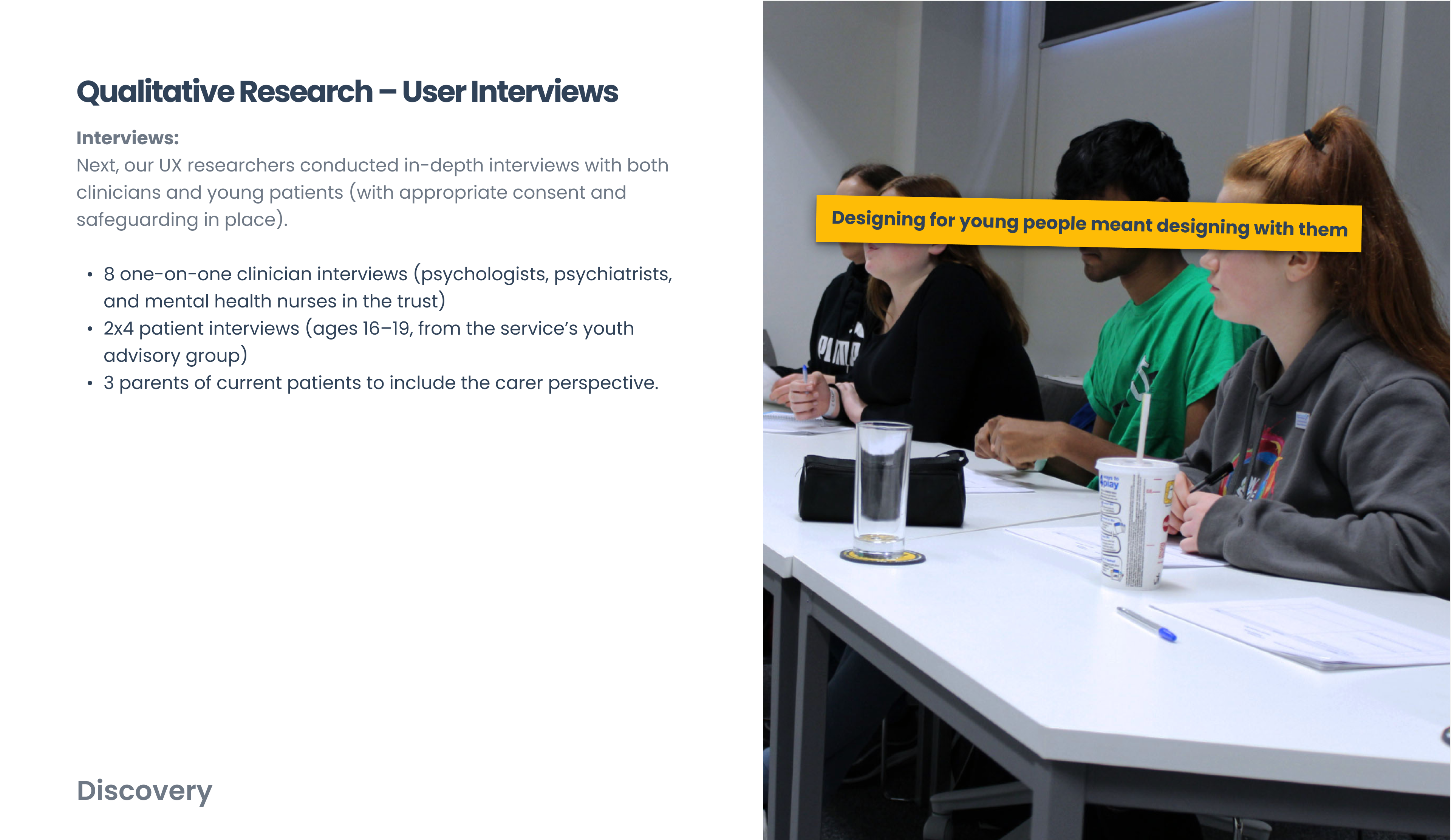
8 users, interviewed and shadowed, plus their parents and carers. Their care-system walkthroughs became the personas below.
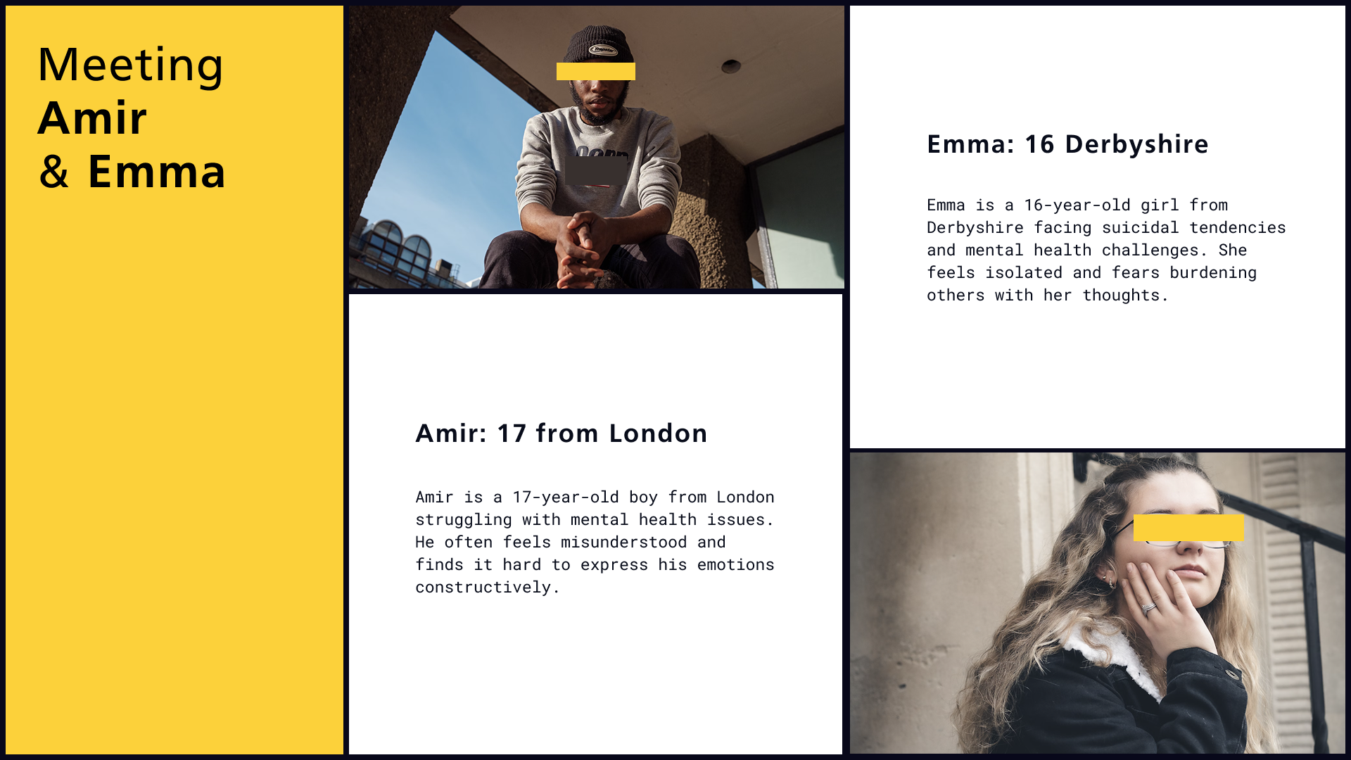
Often feels misunderstood. Opens up to clinicians: a structured, professional setting feels safer than home.
Feels isolated and fears burdening others. Shares most easily with parents, in a familiar, informal setting.
The third corner of the triangle. Moderate tech proficiency, zero patience for tools that add work.
Both personas struggled with the same thing: communicating sensitive issues. The difference was only where they felt safe doing it.
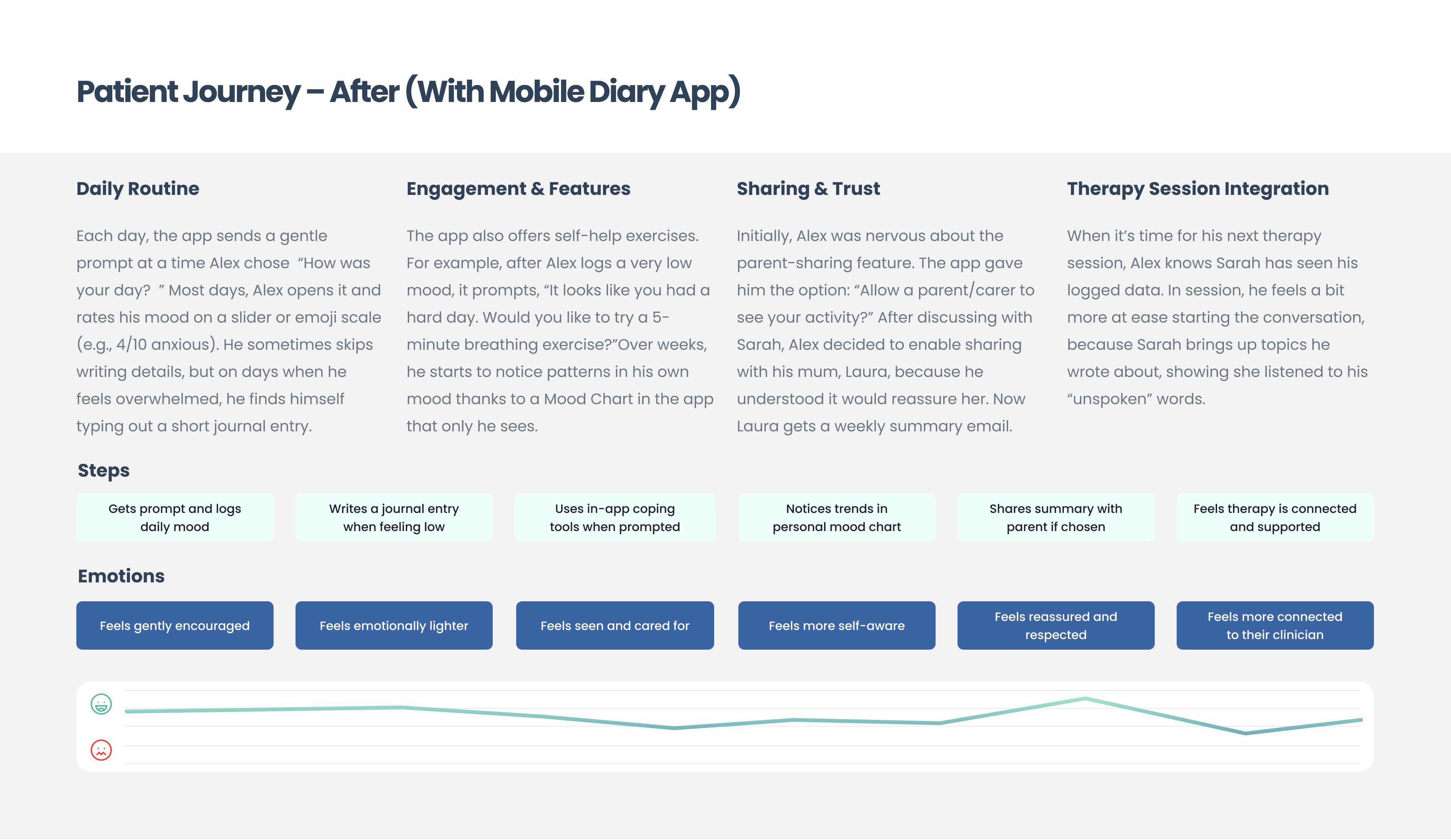
THE CORE INSIGHT · A SAFE SPACE, TAILORED TO EACH COMFORT ZONEOur hypothesis: people open up when they control the pace. So the journey has three deliberate steps.
A private space to record and reflect. No pressure to share, no judgment. Confidence builds one entry at a time.
Once recording feels normal, tools help process what's there:
Knowing their own patterns lets users decide when and how to ask for help. Intentional communication instead of overwhelmed oversharing.
The ten-second daily loop, playable. Pick a day, log a mood. Nothing leaves this widget: that's the point. Sharing is a separate, deliberate choice.
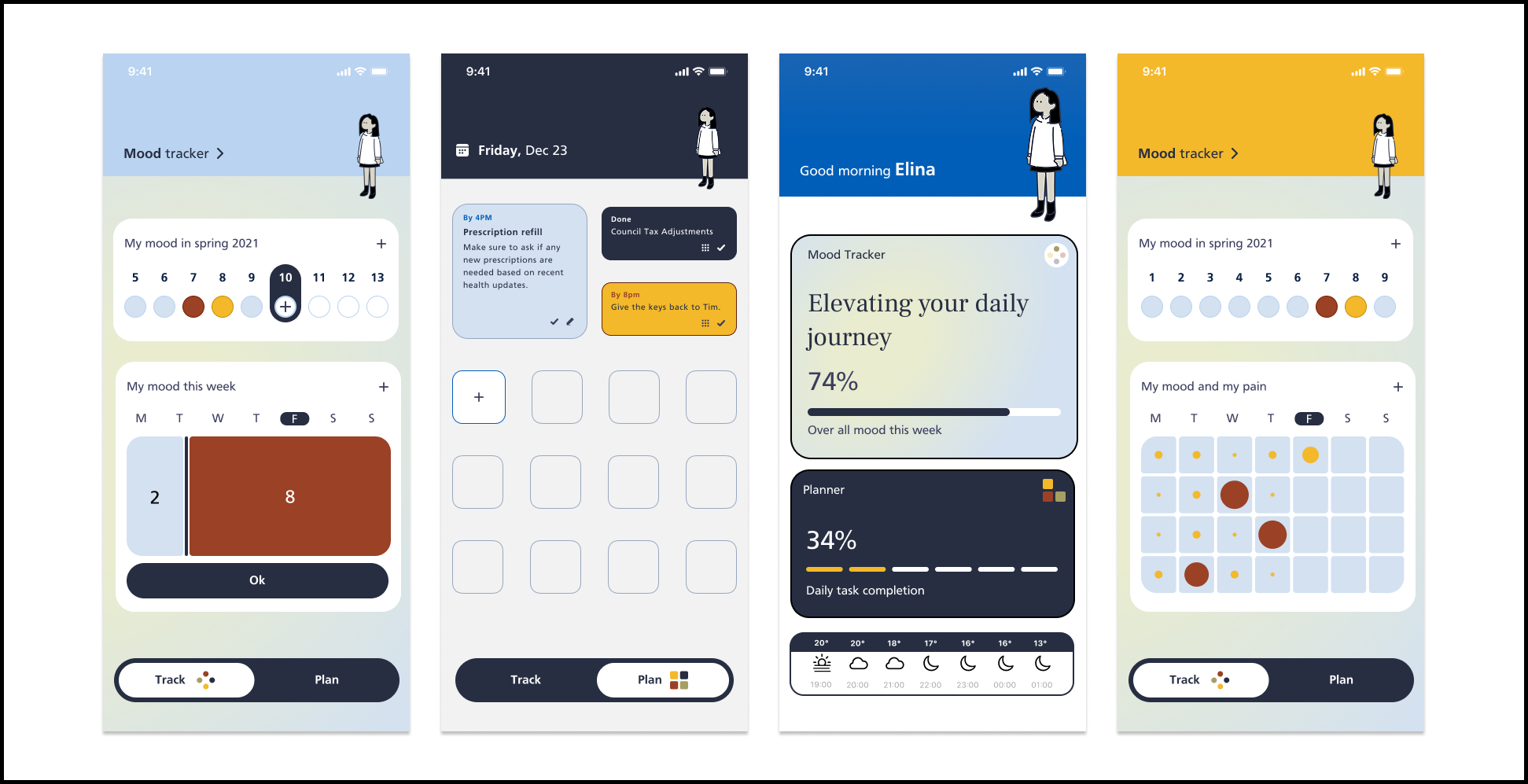
A capture of the proof-of-concept in motion: the daily prompt, the mood log, the private chart building up day by day. This is the exact build our eight users tested in the office every week for six weeks.
No app budget yet, so we built a proof of concept and brought users into the office, every week for six weeks, watching them use it and interviewing in real time.
First contact with the portal. Friction mapped, emotional responses logged next to functional feedback.
Post-session conversations became fixes: mood tracking enhanced, goal-setting simplified, flows smoothed.
The biggest shift: how users talked to their parents. More understood, more supported, steadier week by week.
All 5 clinicians navigated the prototype successfully and found the data useful. Favourites: the patient timeline graph and the alert flag on concerning entries.
We'd labelled the mood graph "Wellbeing Score over 4 weeks" and two clinicians couldn't tell if higher meant better or worse. Renamed to plain language: "Mood (1 = low, 10 = high)." Clarity beats cleverness.


Empowering them to share at their own pace was the key to healthier communication. The testing didn't just validate the design, it changed relationships.
OUTCOME · SIX-WEEK IN-PERSON STUDY